
INTERACTION & UX DESIGN
HANDWRITING
Video Components
The goal: To help second grade students learn and practice proper letter formation through animated videos. This digital component supports early writing development and complements printed materials.
The challenge: Because students are still developing fine motor skills and learning letter shapes, the animation needed to clearly demonstrate stroke order and direction—without overwhelming or confusing the viewer. Visuals had to be intuitive and paced for young learners, with an engaging interface. It was also very important to the team that we accomodate our left-handed learners.
My role: I designed the animated handwriting system using Adobe Animate, ensuring each letter began at a consistent transformation point and followed predictable motion paths. I created a reusable template for consistent pacing and visual style, collaborated with other designers and the curriculum lead for feedback, and built a complete library of over 150 animations aligned to instructional goals, demonstrating correct letter and number formation for both right-handed and left-handed students.

Where we started
Hand grip shown inconsistently, breaking visual trust and user expectations
Overexposed lighting and shifting camera angles distract from what’s being taught
Letters formed incorrectly and unsteady lines increase cognitive load for students
The curriculum lead originally began filming videos videos at home with her iPhone, without a good setup for lighting or camera grip. The quality was not consistent with what one would expect from a company that has been a leader in online education for decades.
Improved interaction
Consistent visual structure reduces mental effort and builds confidence
Steady pacing and line quality ensure visual clarity and motor-matching
Letters match printed workbook, modeling correct technique and reinforcing learning
I created a controlled, repeatable environment that supports young learners through visual clarity and consistency. The final product aligns with the professionalism and polish expected from a trusted online education leader, while also meeting the real needs of early writers.
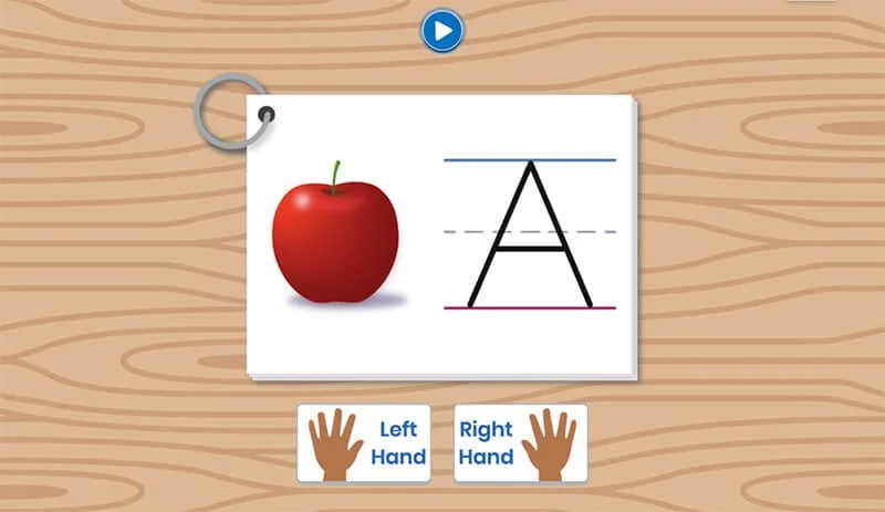
Web Components
The goal:
To upgrade the look and feel of the handwriting course’s interactive components so they align with the print materials, reduce visual friction, and better support young learners’ engagement.
The challenge:
The original version used basic, bland visuals that felt disconnected from the rest of the course. The layout lacked warmth, personality, and clear context—important elements when designing for early elementary students.
My role:
I redesigned the interface to evoke a familiar classroom setting using a woodgrain "desk" background and flashcard-style visuals. I incorporated the illustrated images from the printed workbook to provide continuity across formats, and restyled the interactive buttons to be more inviting and age-appropriate. Every design decision centered around building visual trust, usability, and consistency for our youngest users.

From very early on, Rachel has been someone who can always take a task and run with it. Her attention to detail is amazing, and she is always learning. My hope is to always be surrounded by constant learners who believe there is always room to progress and grow, and Rachel epitomizes that concept to a tee!
-Ben Gamache, Principle Designer, Stride